Summary
Role: End-to-end project lead
Team: 400+ UX team members, 30+ screen owners
Tools: Figma, Slack, Paper prototyping
Methods: Design thinking, systems thinking, usability testing, stakeholder management, RACI framework development
Key Takeaways:
Presenting rapid prototype options with clear trade-offs enabled faster decision-making and early alignment with leadership
Defined governance plan, including an automated verification system and clear accountability from day one
Designed for scalability and clarity, the matrix naturally attracted cross-functional partners who recognized its value for their own needs
Impact:
30 screen owners actively maintaining content with a sustainable governance model
200+ visits in the first week, averaging 25 users per week, ongoing
25% reduction in time to find team and project information
Adopted by Product and Accessibility teams as their organizational source of truth
“The UX Connection Matrix has made it easier for UX and Product members to navigate other teams’ projects and team structures. It has helped establish a centralized location for information about teams and projects, which has been especially valuable after the layoffs and reorgs.”
The Challenge
At Indeed, anywhere from 38–51% of UX team members reported not being able to figure out who was working on what across the global organization, creating duplicated efforts, missed collaborations, and onboarding friction. An existing directory tool had become unreliable and required enormous effort to update after reorganizations, leaving the organization without a trusted source of truth for team structure and project ownership.
Problems to solve:
Multiple teams owned overlapping product experiences, but no system clearly showed which team owned what, creating confusion and duplicated work.
UXers couldn't identify who was working on related projects or how different teams connected to deliver end-to-end experiences, resulting in missed partnership and collaboration opportunities.
Previous tools required substantial manual updates after every reorganization, leading to outdated information and low trust.
Approach
Discovery & Research
Before proposing solutions, I needed to understand why previous attempts had failed and what would make a new system sustainable. My research approach focused on uncovering the root causes of information decay and identifying what features would actually drive adoption. To research, I combined quantitative data analysis with qualitative feedback gathering to validate the problem scope and inform solution requirements:
Analyzed the current directory to identify specific failure points—particularly the massive LOE required for updates and the lack of strategic connection mapping between teams.
Met with UX leadership and several team members to understand their information needs, pain points with current systems, and what would make a new tool valuable enough to maintain.
Insights
Previous tools became outdated within months of major reorganizations. Any new system must have distributed ownership and automated verification to stay current without massive central maintenance.
Users wanted to understand how teams connect and which experiences they own, not just names and titles. Solution needed to map organizational structure to product journey stages, showing strategic connections between teams.
Previous projects were outdated because stakeholders hadn’t evaluated options or LOE prior to launch. I needed to present leadership with concrete options, comparison criteria, and clear timelines before significant investment in prototyping solutions.
Design
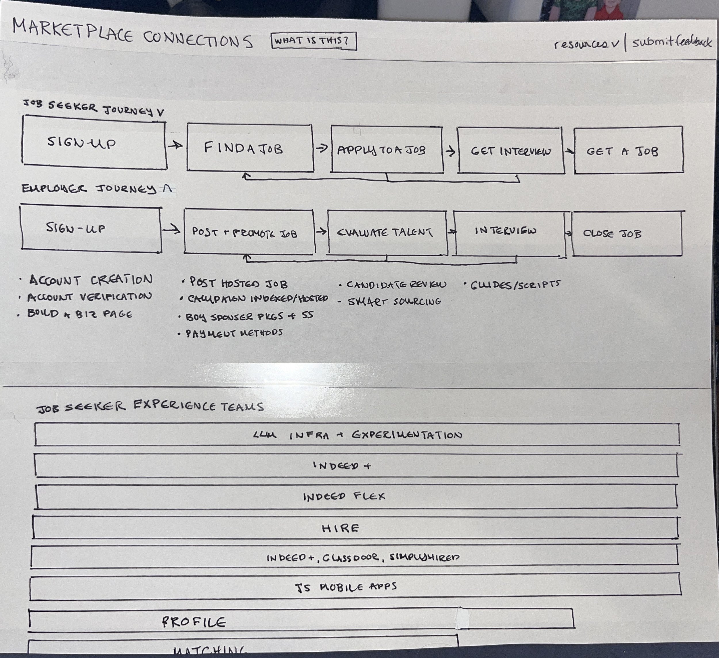
Rather than building a complete solution upfront, I created paper prototypes representing two strategic directions: an evolution of the existing directory versus a completely reimagined card-based system mapped to the user journey through Indeed's products. This approach enabled leadership feedback before significant time investment and ensured the final direction aligned with organizational priorities.
The journey-based approach won because it provided strategic context about how teams connect across the user experience, not just organizational chart information. This decision shaped everything that followed: the card structure, the navigation model, the information hierarchy, and ultimately the value proposition that attracted cross-functional adoption.
Images 1 & 2. The first paper prototype builds on the existing directory, with a more visually appealing layout.
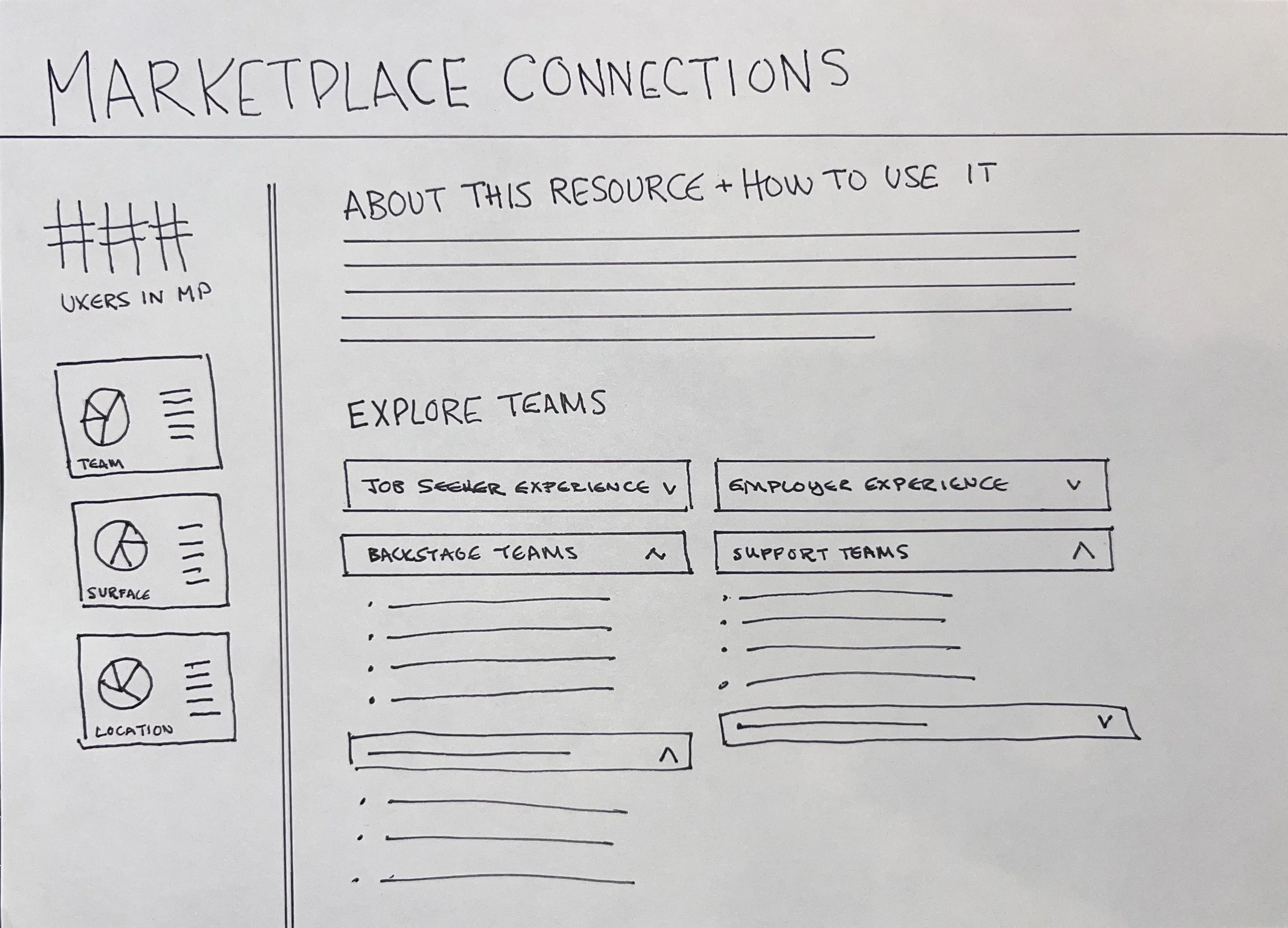
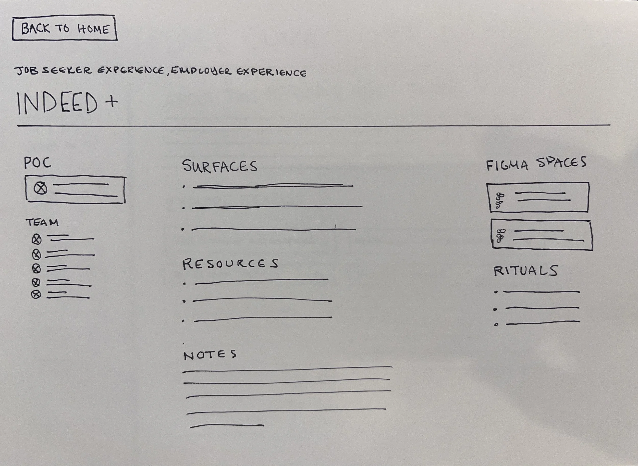
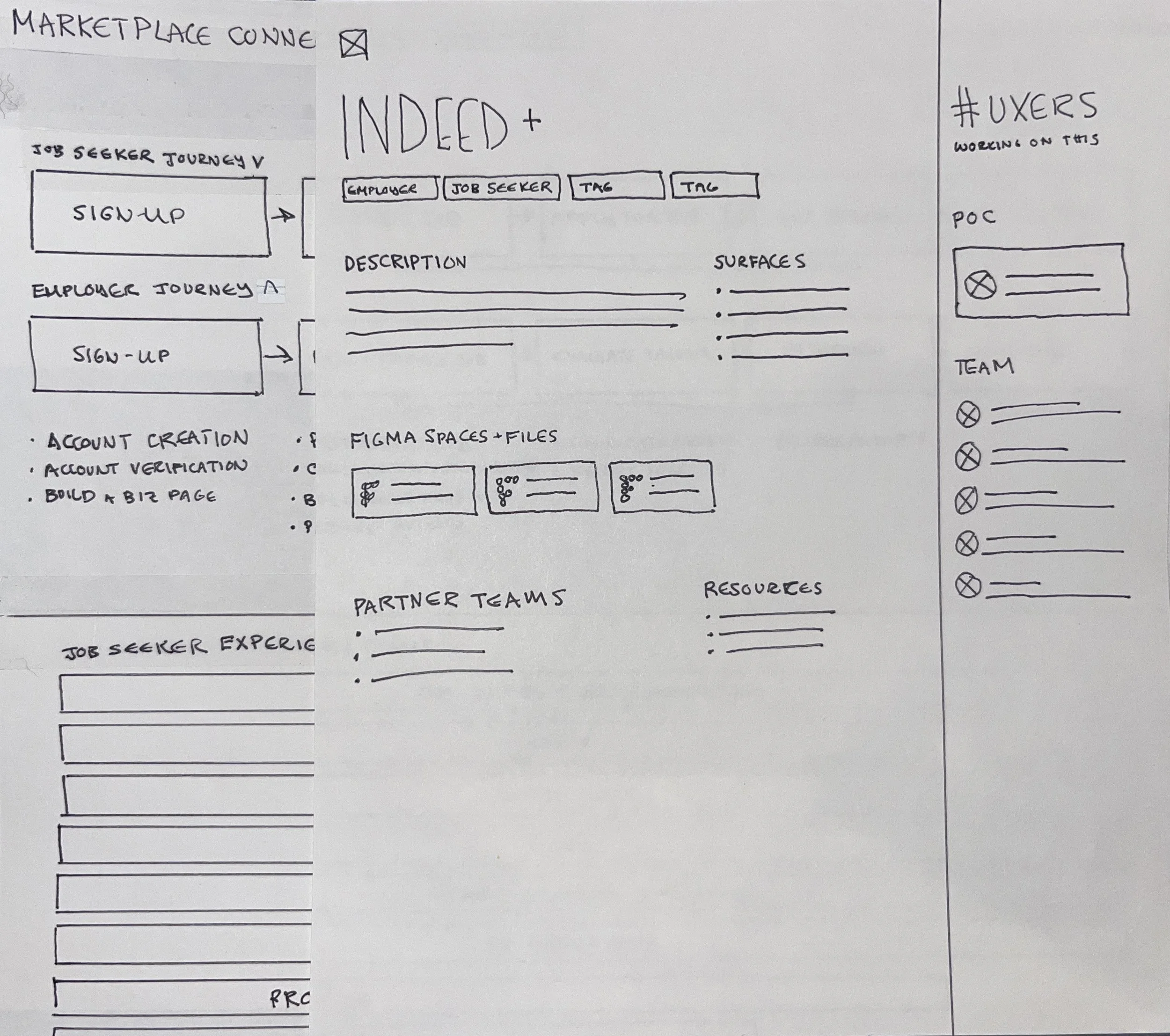
Images 3 & 4. The second paper prototype is a new, card-based layout based on a service blueprint of the user journey through Indeed’s products. This was the selected direction.
Before finalizing the design, I conducted both live and asynchronous usability testing to validate that the interface was intuitive and met user needs. I built a rough Figma prototype based on the leadership-approved direction, then tested it with 8 UXers in live sessions where I could observe their navigation patterns and hear their thinking aloud. I simultaneously sent the prototype to 10+ additional team members for asynchronous feedback, capturing a broader range of perspectives without scheduling constraints. Once I gathered all the feedback I needed, I built out the prototype to prepare for content population.
Implementation & Governance
The biggest risk to this project wasn't the design—it was ensuring the information stayed accurate after launch. If the content became outdated, the tool would be worthless. I needed to solve three interconnected challenges: distributed ownership across 30+ people, inevitable information decay over time, and the lack of any existing governance model to build from. I developed a two-part governance system designed to distribute responsibility while maintaining quality:
I created a detailed RACI chart defining roles and responsibilities for every aspect of content maintenance, eliminating the ambiguity of previous systems. Screen owners were identified for each part of the matrix, and each person listed gave their buy-in in person.
Rather than hoping the 30+ screen owners would remember to update their content, I built automated Slack prompts that sent verification requests to screen owners asking them to update content and/or confirm accuracy, tracking compliance rates to identify and support owners who were struggling.
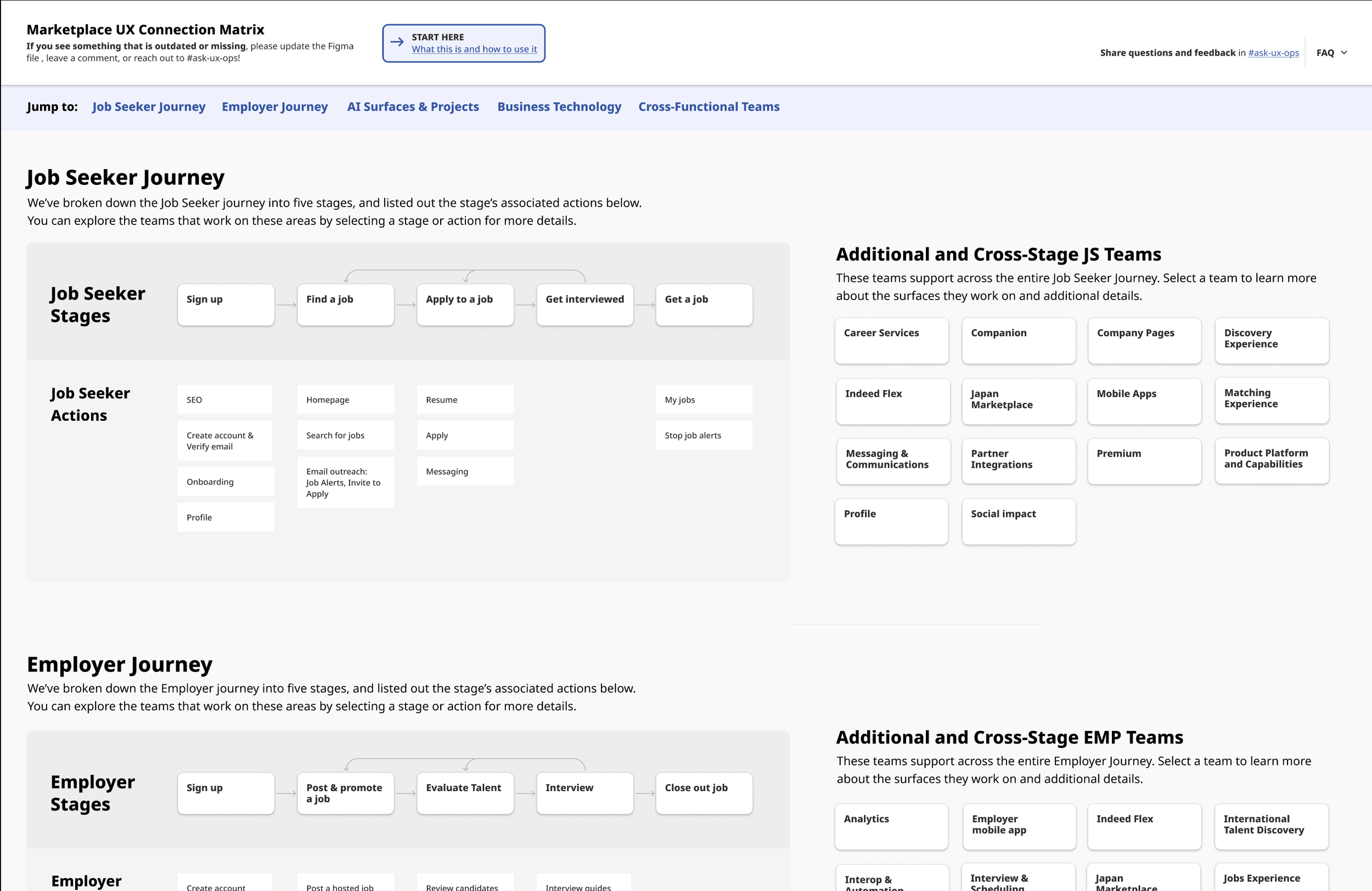
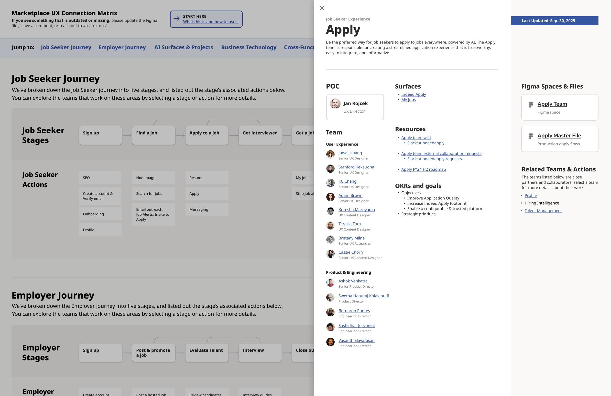
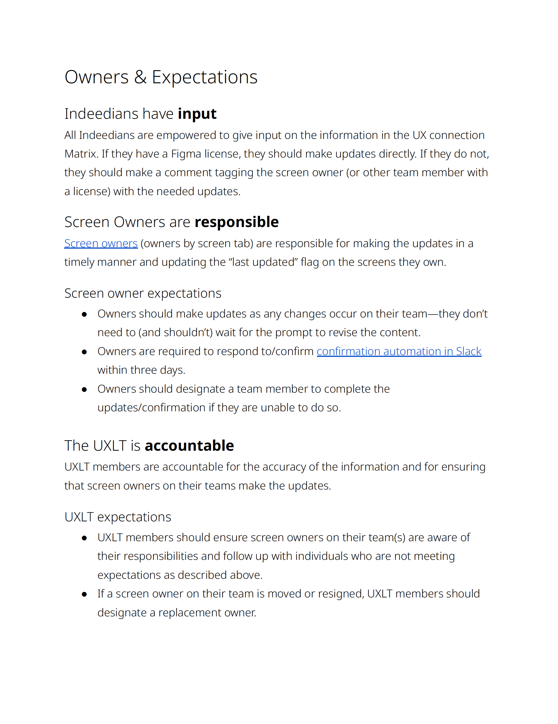
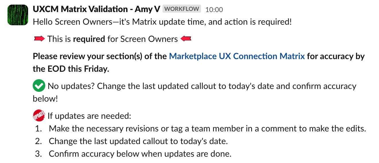
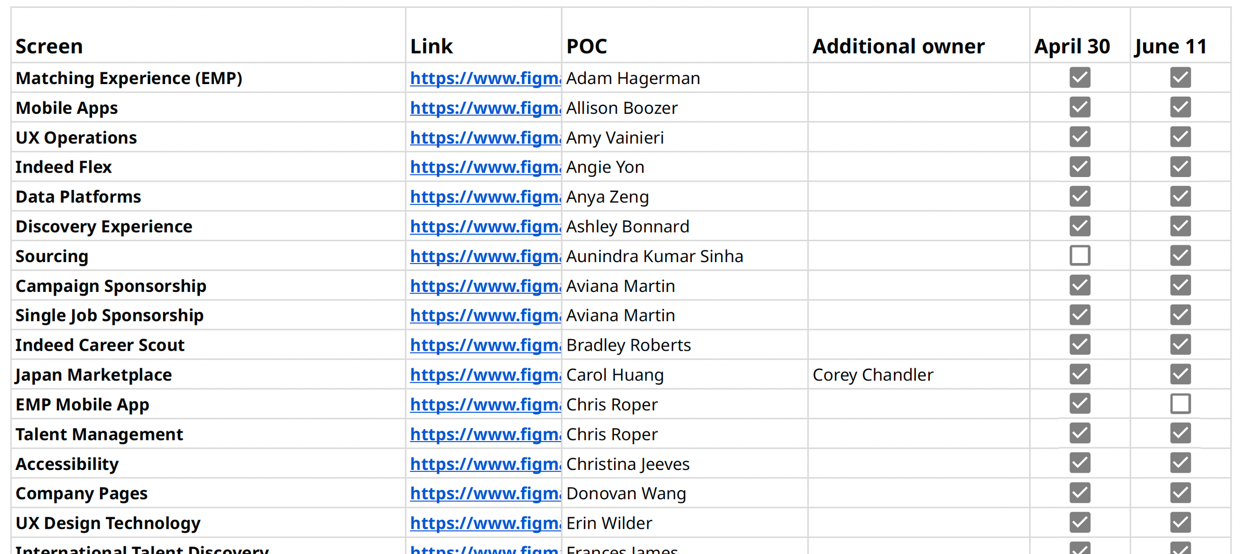
Image 1. Screenshot of the matrix homepage.
Image 2. Screenshot of the matrix with a team page open.
Image 3. RACI definition for governance plan.
Image 4. Automated Slack message sent to screen owners every six weeks.
Image 5. Verification document to track and confirm content updates.
Launch and Adoption
I designed a multi-channel launch strategy including announcements via email, Slack, and team meetings, live demos in all-hands gatherings, and a recorded "How to Use" guide. To build organic momentum, I empowered key UXers and managers to answer questions and socialize the tool within their teams.
From day one, I monitored Figma analytics, collected qualitative feedback during 1:1s, tracked screen owner compliance with verification checks, and conducted regular quality assessments with leadership. The data showed strong adoption: 200+ visits in the first week, stabilizing to 25+ weekly active users.
“I appreciated Amy’s efforts in bringing people together for the Connection Matrix. This resource has proven to be extremely helpful in identifying UX points of contact across the organization.”
Results & Impact
Quantitative Outcomes
Adoption: 200+ visits in first week post-launch, stabilizing to 25+ weekly active users ongoing
Efficiency: 25% reduction in time to find team and project information (self-reported by users)
Sustainability: 30 screen owners actively maintaining content with 90%+ compliance on verification checks
Cross-functional expansion: Adopted by 2 additional teams (Product and Accessibility) as their organizational source of truth
Qualitative Impact
The matrix transformed from a UX-only tool into Indeed's organizational reference point for product team structure. Product teams adopted it to track ownership across journey stages. Accessibility quality assurance uses it to verify compliance coverage. New hires consistently cite it as essential during onboarding.